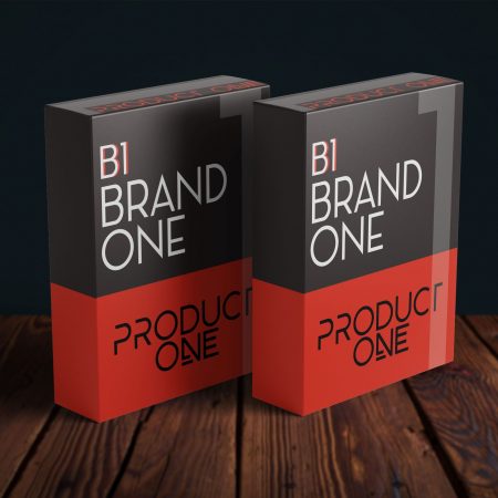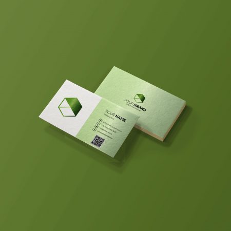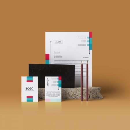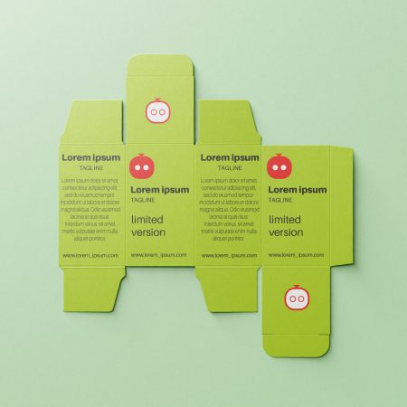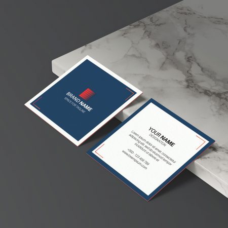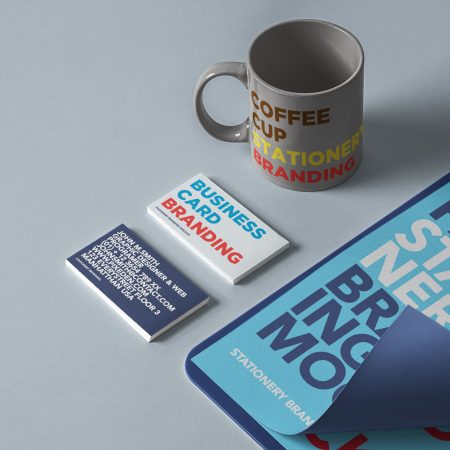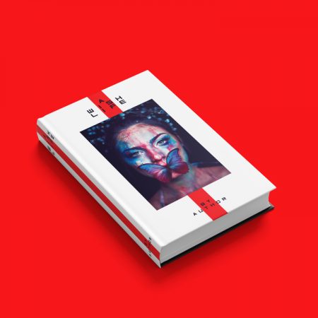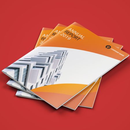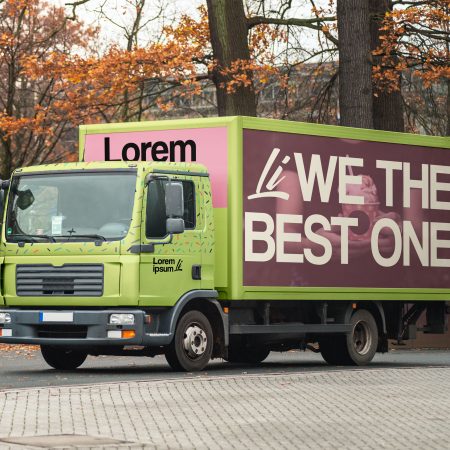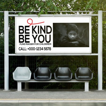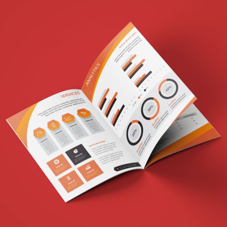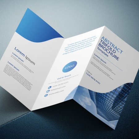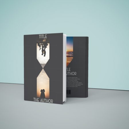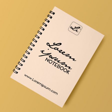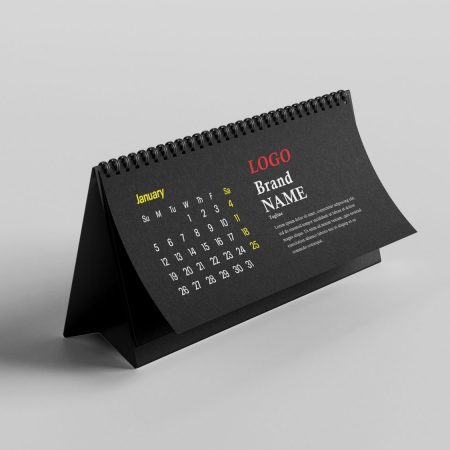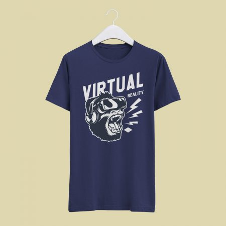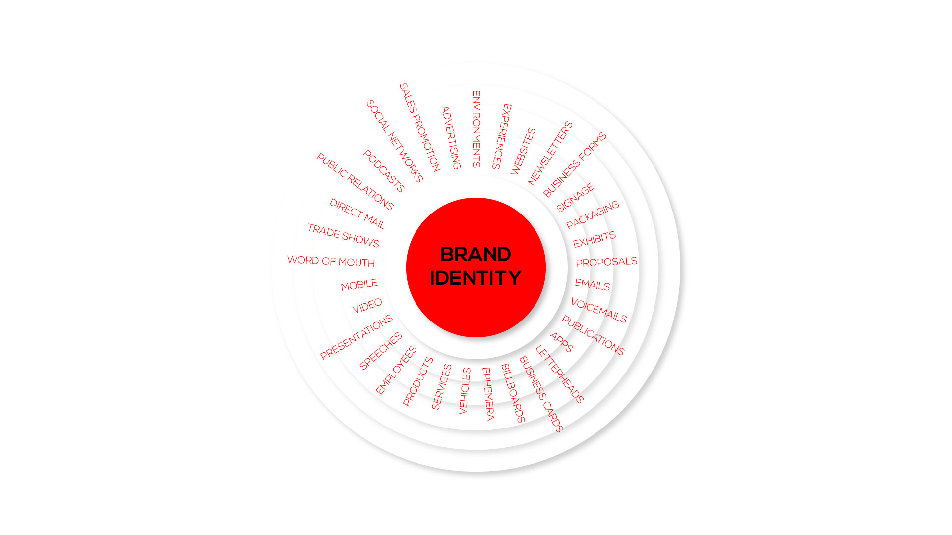
Every touchpoint is important, but only few are very important with respect to the brand type. Therefore, please enquire here about the touchpoints required for your brand identity.
Are you looking for a Graphic Designer?
Order Brand Identity Services
Brand Identity
Your Brand is your most valuable asset.
Building a Brand
First, corporate identity has the power to maximize business recognition. Second, brand identity can make a difference to your brand from other brands. Third, a brand identity brings meaning to the brand.
Therefore, building a brand must be designed in a very basic, calm and unique way. Please order your brand identity design to fuel your brand recognition.

Logo
Generally, a logo consists of a sign or a symbol. And it should have probably one or two colors in it. In fact, few logos require more than three colors. Remaining other logos are just black and white. Therefore, every logo is designed in such a way that it must be simple and identifiable.
Font
Truly, we know that fonts have personality. In fact, a font is capable to communicate a clear message to the audience in an engaging way. Certainly, a font is one of the main assets to your brand/company. Therefore, I choose the fonts thoughtfully and carefully.


Color
Third, a color, in general, have a psychological power. A color has its own importance and it means things. Therefore, it important for me to design a brand with colors which speaks about the psychology and significance of the brand/company through a palette of colors.

Pattern and Texture
Pattern and Texture is the key brand design element. To explain, it basically helps a brand to elevate its identity among large industrial competitors. For example, a pattern can happen all over the chocolate bar wrap. A pattern over the storefront can be very attractive and recognisable.
Photography and Animation
Photography and Animation. Generally, the audience finds styling and moving designs most attractive. There are many photographic styles around. But, by applying at least one style to the brand touchpoints makes it very easy for the audience to identify the brand. In addition, animations are an added advantage for brand recognition.

Illustration and Iconography
Similar to photography and animations there are many illustrations and iconography styles all around. But, the application must be very relevant and design specifications which is suitable for the brand. Personally, I take care of this section and make sure they are consistent for the brand. And this is the sixth element in the list.

Sound
Seventh, it’s sound. Truly, sound can be used in brand identity. For example, the background sound of famous NOKIA and INTEL. In fact, not every brand need a sound. But, the perfect sound for a relevant brand has more advantage.
Layout
Eighth element in the list is Layout. In fact, using a particular style of layout consistently throughout all the touchpoints represents the vocabulary of the brand. To explain, this helps the audience to recognize the brand quickly and in an effective way.

Tone Of Voice
Last, the tone of voice. Usually, it speaks about the tone of the brand. In other words, it implies what the brand want say to the audience? As a result, it displays whether the brand is formal or informal. In detail, it gives a clear idea about the brand.


