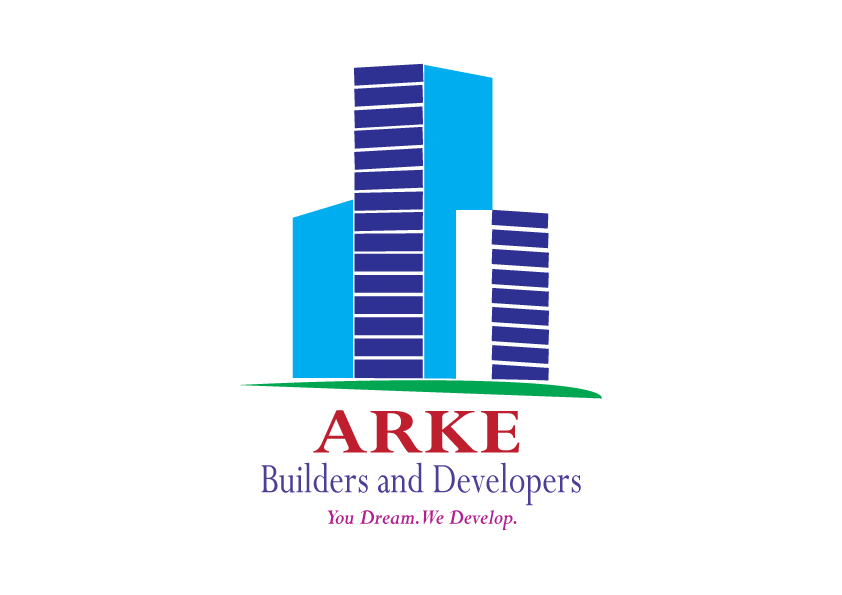
Logo Design
Business Card
Project
ARKE Builders and Developers
Project start date: 15/10/2019
Project end date: 09/11/2019
ARKE Builders and Developers is a startup construction company. Initially, the client had approached me with their brand identity requirement. Later, it was understood that the ultimate requirement was brand identity and recognition. Eventually, the project was decided and the services I had provided are as follows:
- Logo Design
- Web Design
- Business Card
- Letter Head
Web Design
Letter Head
CLIENT SAMPLES FOR LOGO DESIGN
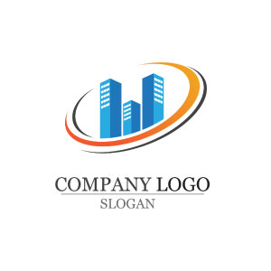
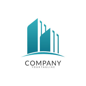
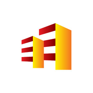
Basically, the above images are few sample examples the client have selected as a reference. Given that, now I came to know how their logo must look like. However, at this moment I have only these samples to work on. Therefore, it is understood that the client is expecting a few buildings and support which can reference a lawn or a garden under the building. In fact, by the looks of the sample images, the image must have a 3D look and using negative space to fill the shape.
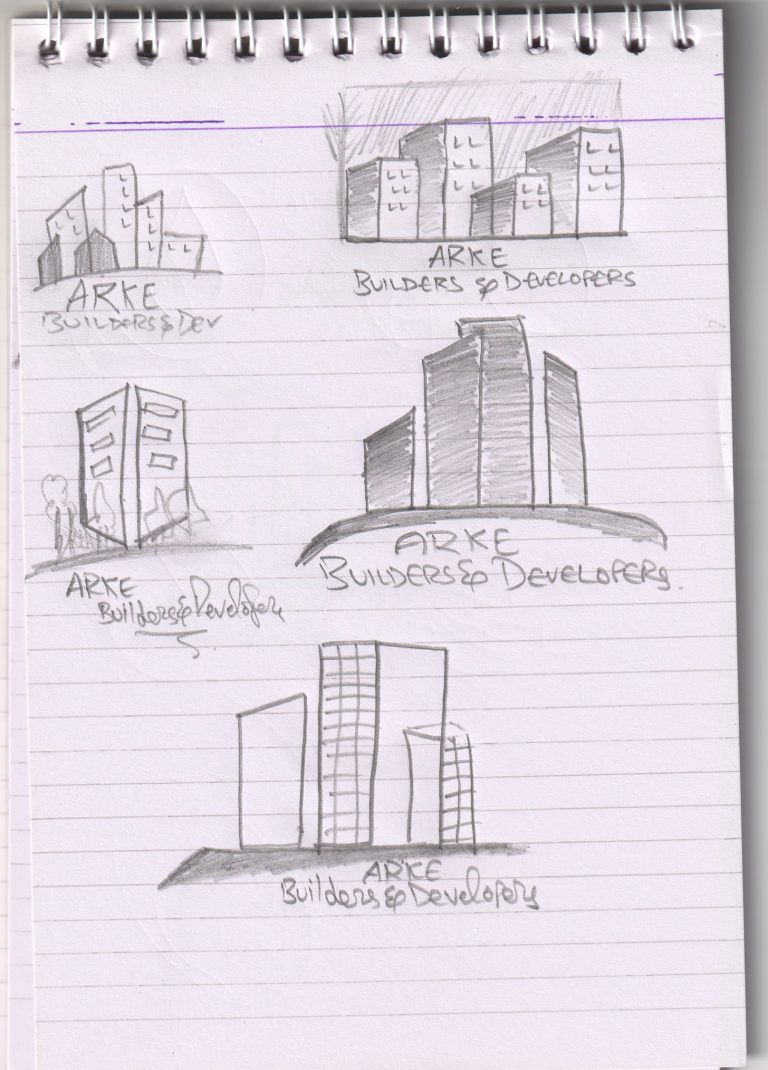
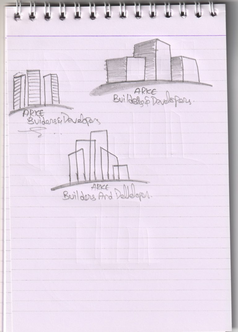
Eventually, below are the sample drawings I had come up with initially.


Final Logo
In fact, initial sample drawings made it easy for the client to choose their brand identity logo. Eventually, 8 samples are provided to the client and they came up with the best of three. Later, the final version was designed in such a way that, it has a 3D look, a garden, and building of different sizes.
Hurrah!! The client loved the final version.
Business Card
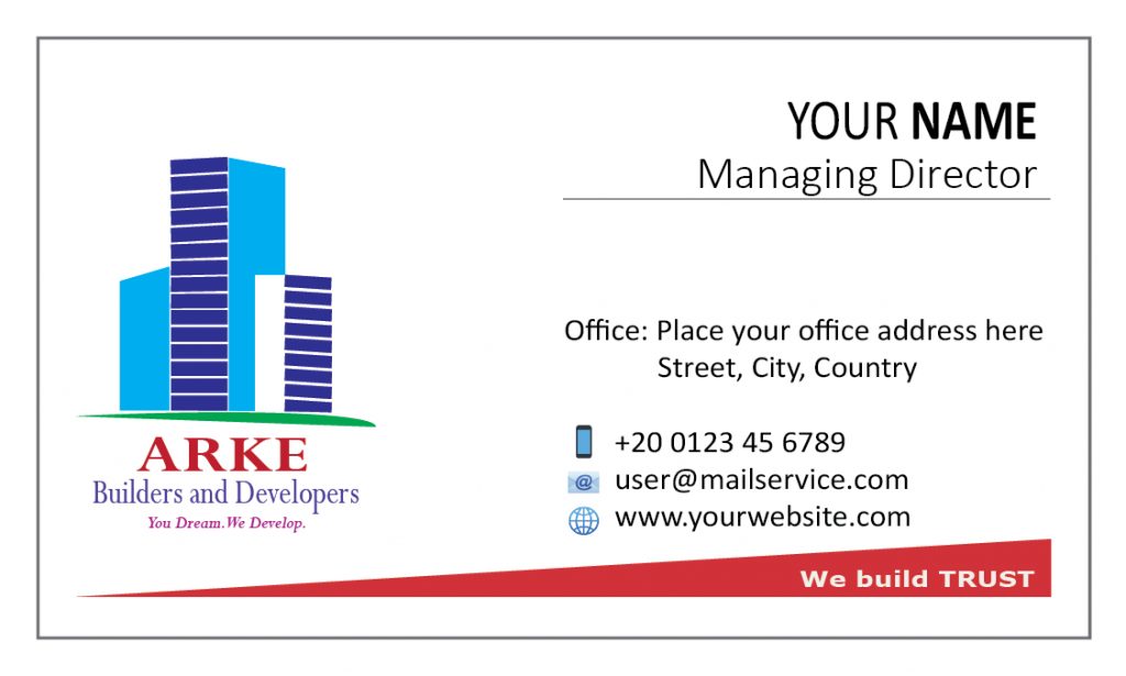
Initially, the client asked for a very simple business card. In this case, they chose to go for a one-sided business card. Here, the authenticity of the company brand and simple smart designed were focused mainly on this business card design.

#00AEEF
#2E3192
#BE1E2D
#4D3E98
#2E3192


Website Design
Frankly speaking, a simple structured detailed wordpress website was built for ARKE Builders and Developers. However, the website is yet to be published and it is under hold by the client. In fact, this website consists of four pages and an additional blog post.
Easy, Simple and To the point.
Letterhead Design
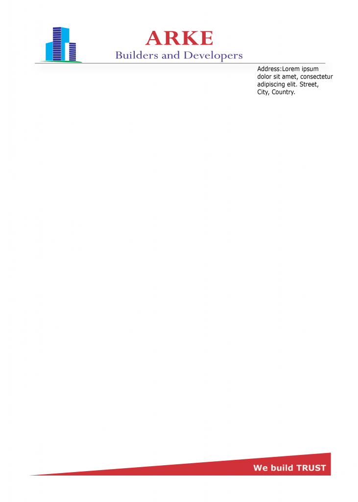
A letterhead was requested to design. Here, the requirement was not to lose the authenticity of the company brand. Therefore, every precaution was taken to complete the letterhead design.

Are you looking for a Graphic Designer?
Order Graphic Design Services

